FF&E Specification Software
Built for Teams
Specification Software
Your Team Will Actually Love
Gather is a powerful, yet refreshingly simple-to-use tool that enables design teams to confidently manage complex commercial, hospitality, and residential ff&e projects with ease.



Trusted by some of the industry's best
Trusted by some of the industry's best
Trusted by some of the industry's best
Trusted by some of the industry's best
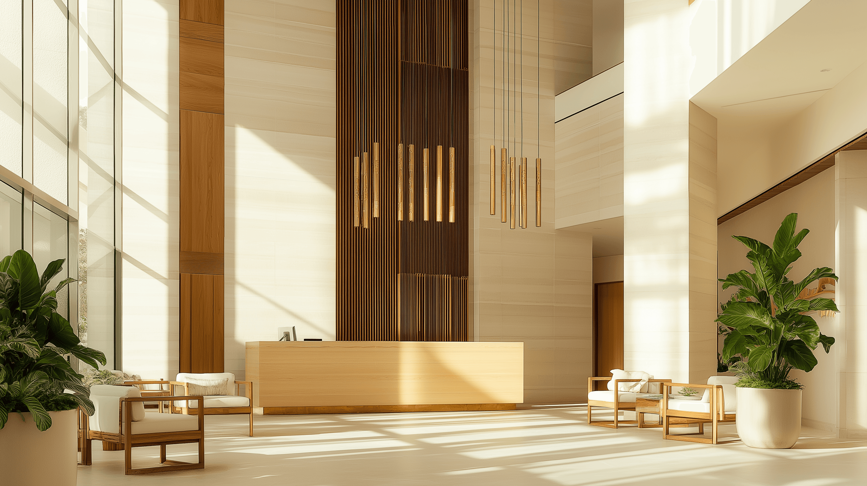
Develop designs.
Manage data.
Issue specs.
Together as a team.
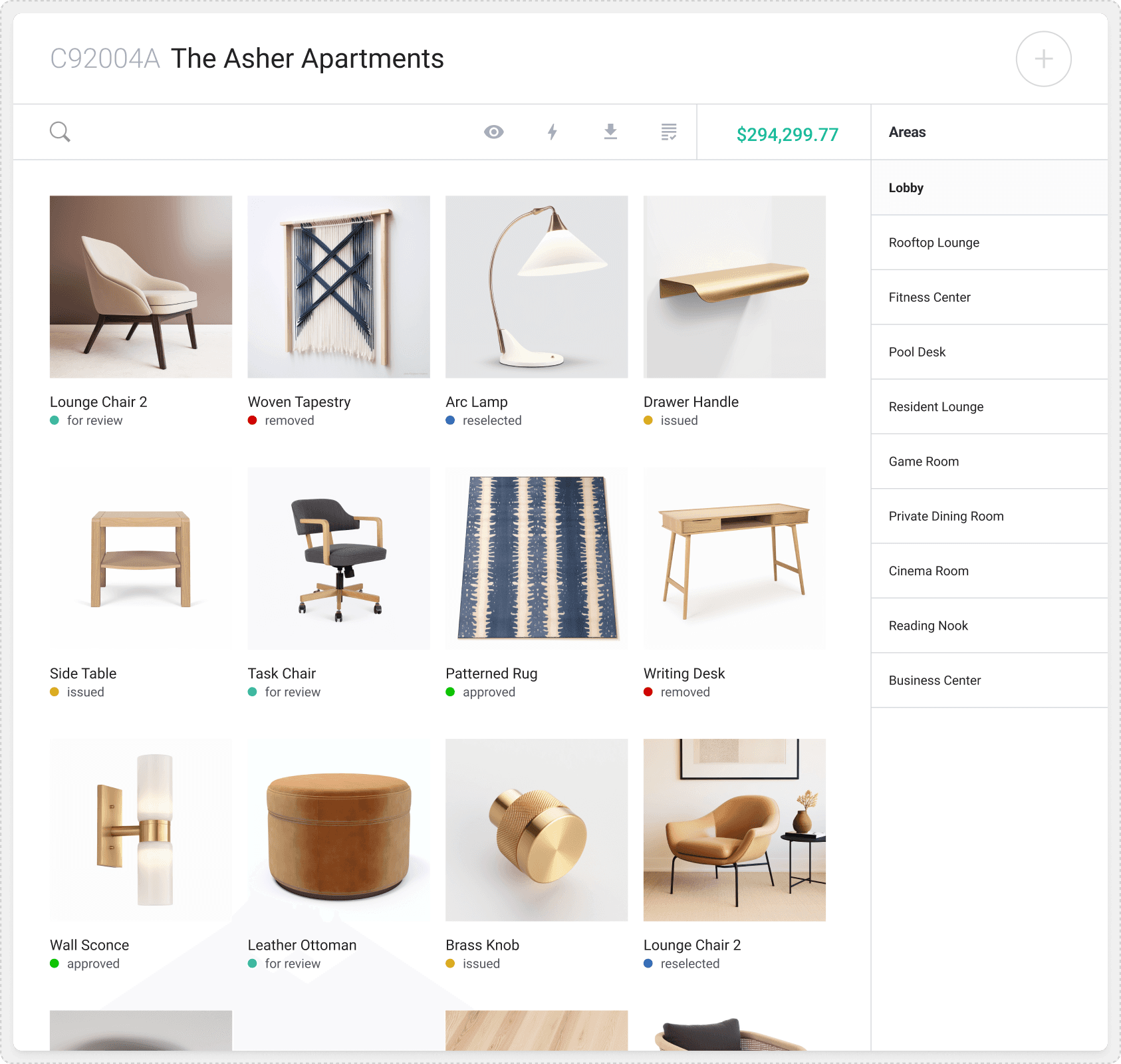
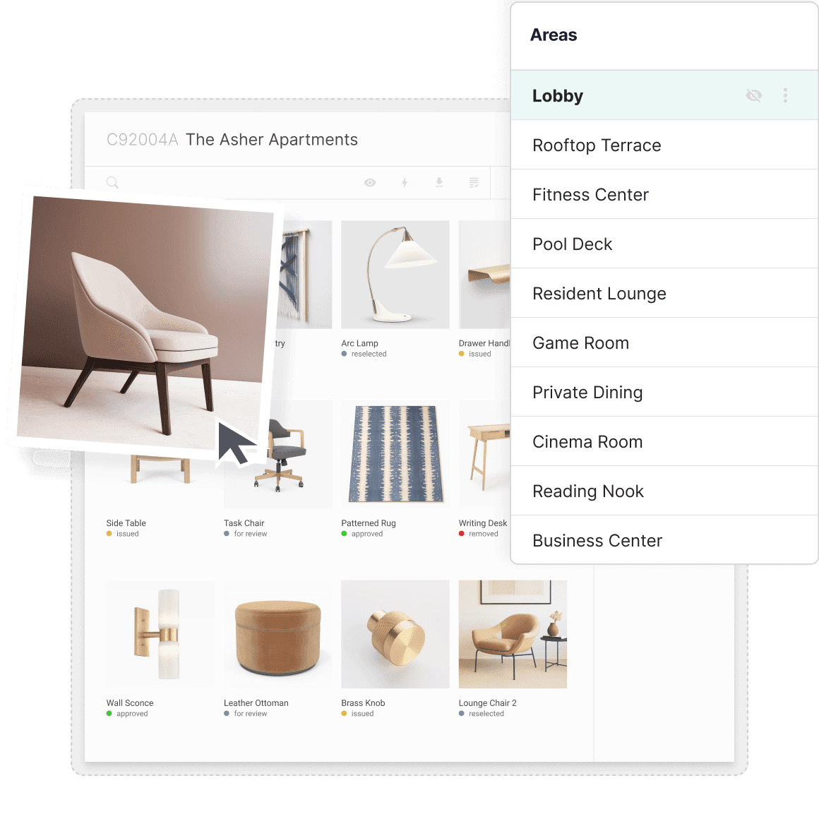
Develop Your Designs
Iterate quickly using intuitive and flexible design tools. Tinker with selection options, align costs with budgets, then transform your design into rock-solid specifications.
Features include:
Web Clipper Tool
Drag & Drop Pin Boards
Real-time budget & Cost Analysis
Learn About The Design Development Workflow

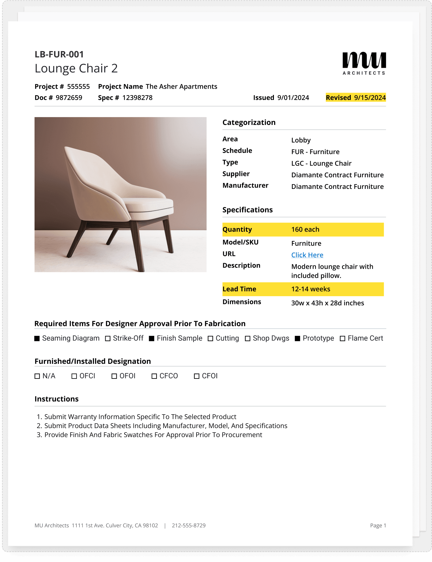
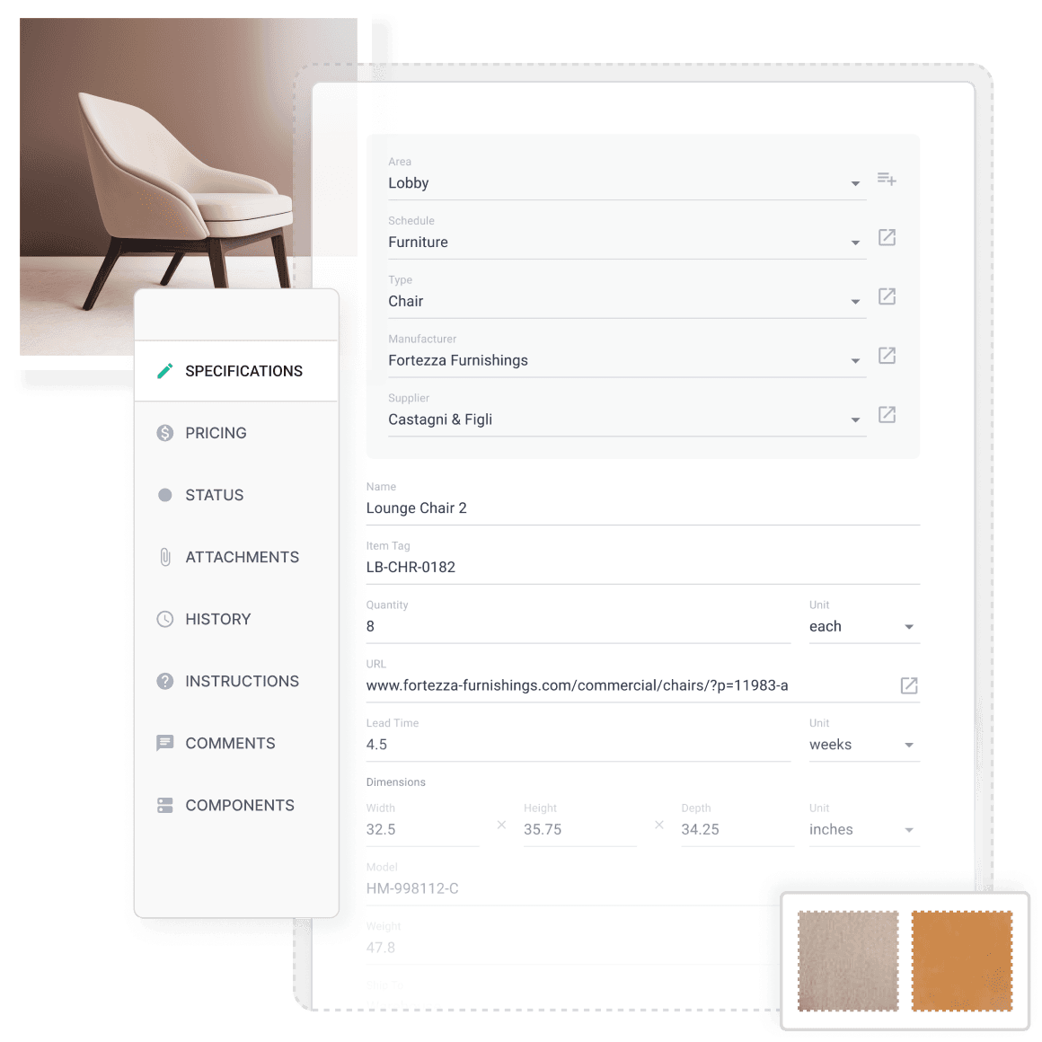
Specify with Incredible detail
Capture every detail with precision, reducing costly mistakes. Gather's commercial-grade tools help you manage spec data for even the most demanding projects.
Features include:
Customizable data fields
Submittals, instructions, and designations
Statuses, Dates, attachments, components and more
Learn About The Data Management Workflow

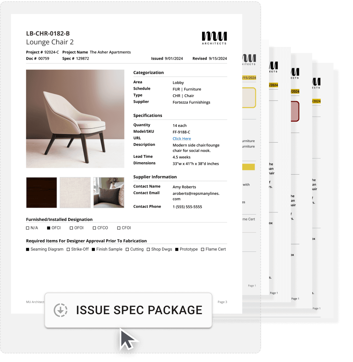
Issue Consistent Specs Every Time
Issue specs with all of the information your clients, contractors, and purchasing agents expect. Share with your team and outside collaborators with the click of a button.
Features include:
customize all data that’s exported
over a dozen templates & reports to choose from
save presets for 1-click exports
Learn More About The Spec Issuance Workflow

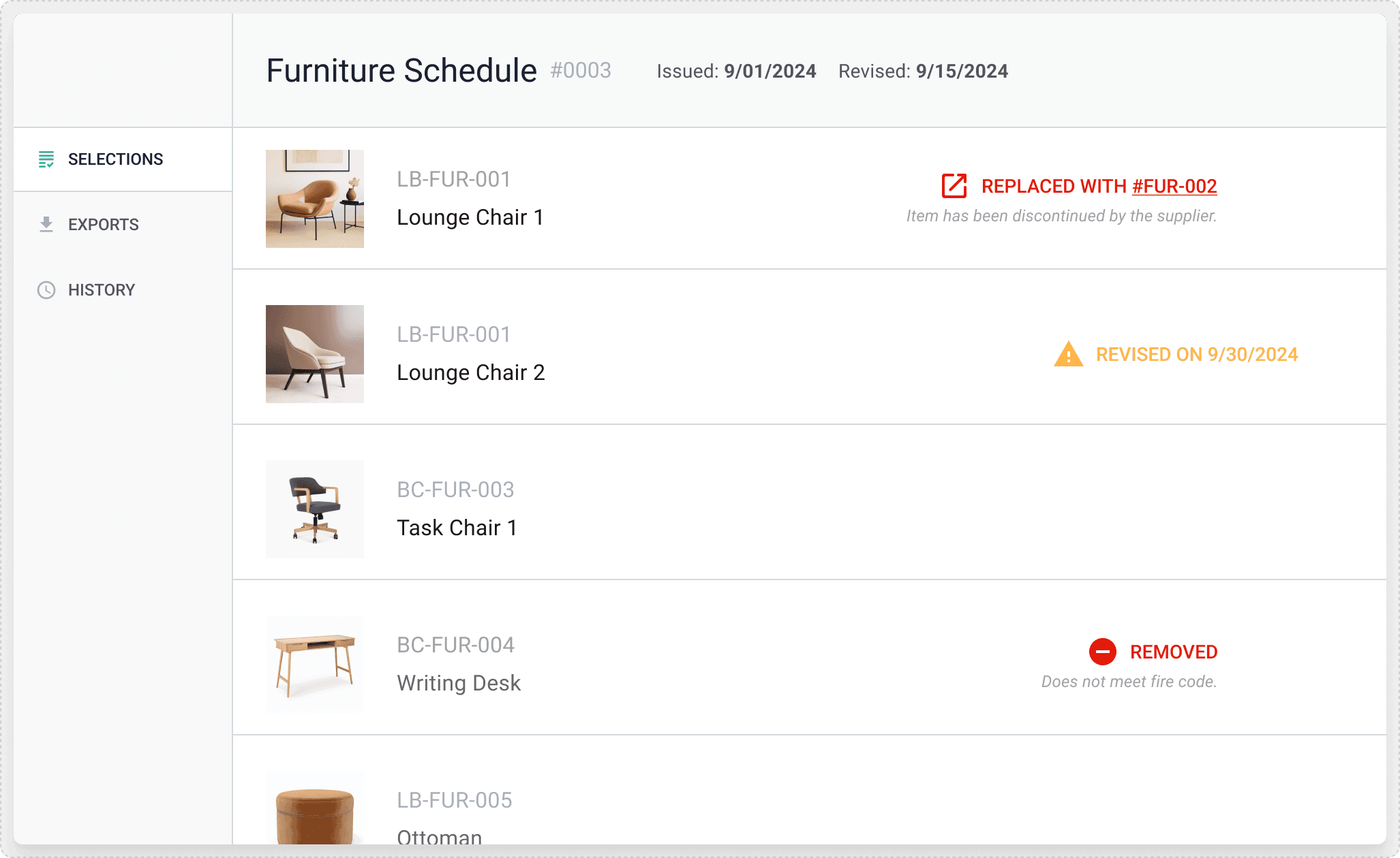
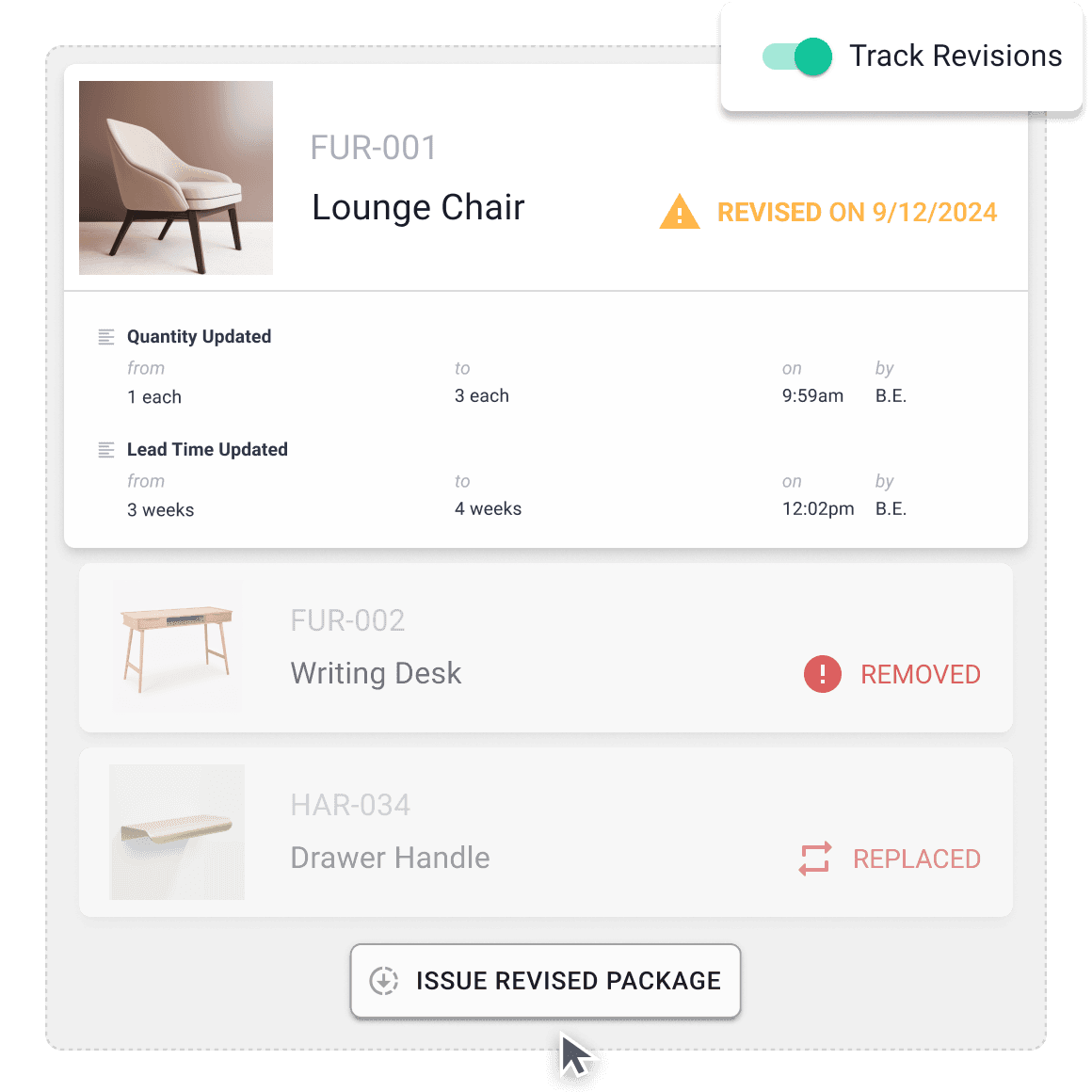
Track Revisions Automatically
When you make an edit in Gather, the system tracks the revision for you. Then, when you need to re-issue your specs, the changes are marked clearly for all to see.
Features include:
issue and revision dates are applied automatically
Add, Remove, and Re-select with a couple of clicks
Any revisions made will be clearly visible

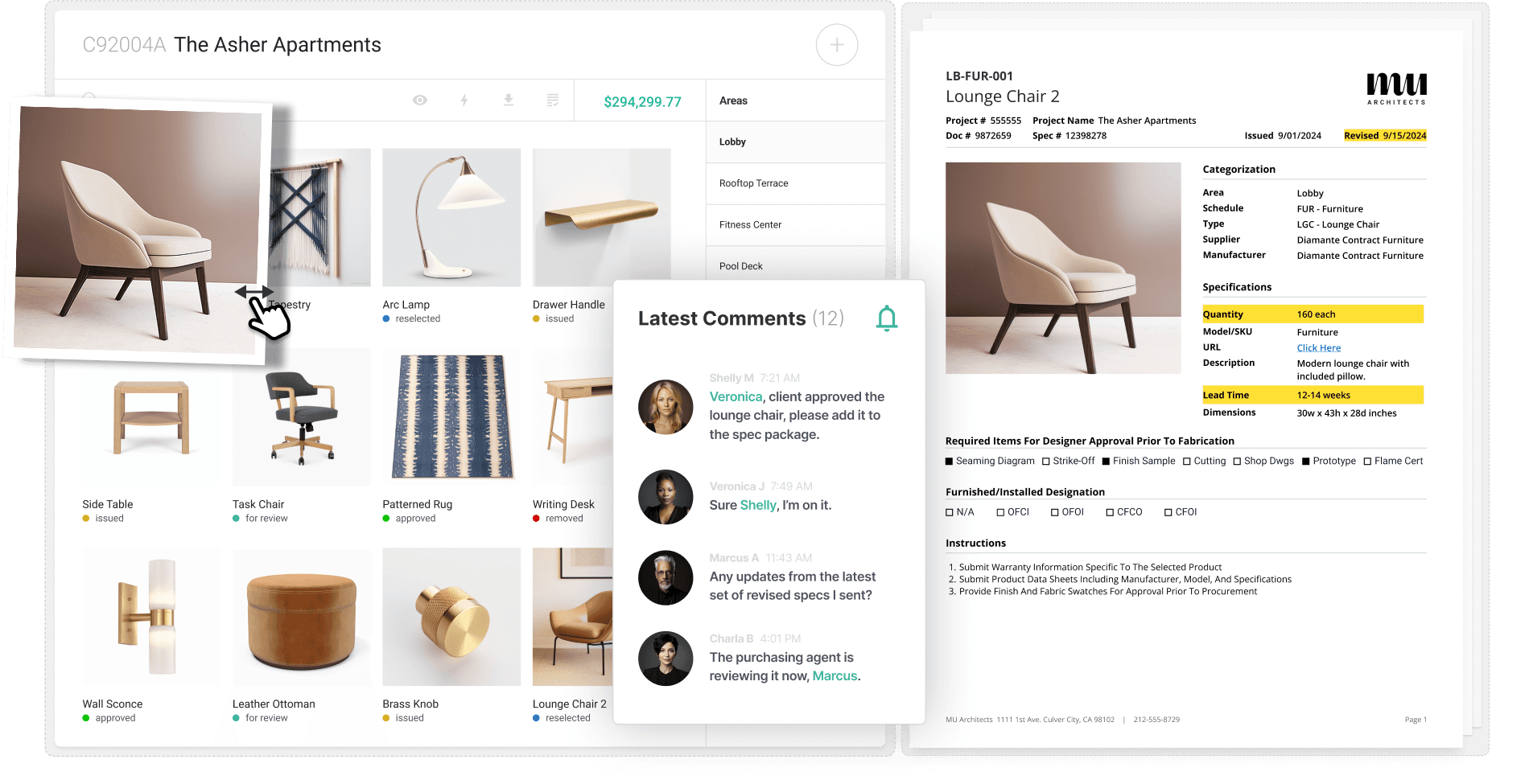
Discuss Everything with Your Team
Discuss selection decisions, specification details, and project requirements with Gather’s real-time chat system.
Features include:
Chat with your team about selection details
Discuss & coordinate project progress
Notifications keep your team up-to-date

Discuss Everything with Your Team
Discuss selection decisions, specification details, and project requirements with Gather’s real-time chat system.
Features include:
Chat with your team about selection details
Discuss & coordinate project progress
Notifications keep your team up-to-date

Discuss Everything with Your Team
Discuss selection decisions, specification details, and project requirements with Gather’s real-time chat system.
Features include:
Chat with your team about selection details
Discuss & coordinate project progress
Notifications keep your team up-to-date

Discuss Everything with Your Team
Discuss selection decisions, specification details, and project requirements with Gather’s real-time chat system.
Features include:
Chat with your team about selection details
Discuss & coordinate project progress
Notifications keep your team up-to-date


I can access information when I'm in our Gather account. I can see what furniture other people are pulling for different projects without having to bother them for that information. It’s extremely helpful.
Jacklyn Bacon
|
Interior Designer
|
BVH Architecture

Having Gather in our team’s arsenal has completely changed the way our team functions and communicates with one another. I would estimate that Gather saves us 5-6 hours a week per person.
Emily Nielsen
|
Design Operations Manager
|
Studio McGee

Having the Library at our fingertips has been extremely convenient. By simply plugging in an item and scrolling through the photos, it helps to speed up the process, especially when looking through multiple furniture options such as table tops and table bases.
Amy Chaloupka
|
Design Coordinator
|
Richardson Design

Using the spreadsheet before was so inefficient and clunky. Our team was having to spend their time on administrative tasks and hunting for details instead of spending their time on design work. Whereas with Gather, it gives you the list of things that you need to fill out.
Sarah Stanke
|
Senior Interior Designer
|
Kass Wilson Architects

What I love about Gather is it facilitates such clear communication. It allowed us to have a spec package that was tight enough that when we got there, I think we had everything on site except for two pieces.
Danielle Vevea
|
Principal Designer
|
Variant

Gather simplified our custom furniture design and fabrication process. Streamlining everything from brainstorming in PowerPoint and organizing specs in Excel to compiling images, drawings, and details into an RFP, then exporting to PDF. With Gather…Ta-Da! your document is ready
Larry Johnston
|
Senior VP
|
The Connell Company

Having Gather has given us an incredible amount of efficiency throughout our design process.
Tania Martin
|
Director of Interior Design
|
The UP Studio

Gather’s intuitive formatting and user-friendly interface have revolutionized our specification process. We’re particularly impressed with Gather’s ability to handle the complexities of hospitality-level specifications without the cumbersome systems of the past.
Grace Machado McClurg
|
Founding Principal
|
Design-Art

I can access information when I'm in our Gather account. I can see what furniture other people are pulling for different projects without having to bother them for that information. It’s extremely helpful.
Jacklyn Bacon
|
Interior Designer
|
BVH Architecture

Having Gather in our team’s arsenal has completely changed the way our team functions and communicates with one another. I would estimate that Gather saves us 5-6 hours a week per person.
Emily Nielsen
|
Design Operations Manager
|
Studio McGee

Having the Library at our fingertips has been extremely convenient. By simply plugging in an item and scrolling through the photos, it helps to speed up the process, especially when looking through multiple furniture options such as table tops and table bases.
Amy Chaloupka
|
Design Coordinator
|
Richardson Design

Using the spreadsheet before was so inefficient and clunky. Our team was having to spend their time on administrative tasks and hunting for details instead of spending their time on design work. Whereas with Gather, it gives you the list of things that you need to fill out.
Sarah Stanke
|
Senior Interior Designer
|
Kass Wilson Architects

What I love about Gather is it facilitates such clear communication. It allowed us to have a spec package that was tight enough that when we got there, I think we had everything on site except for two pieces.
Danielle Vevea
|
Principal Designer
|
Variant

Gather simplified our custom furniture design and fabrication process. Streamlining everything from brainstorming in PowerPoint and organizing specs in Excel to compiling images, drawings, and details into an RFP, then exporting to PDF. With Gather…Ta-Da! your document is ready
Larry Johnston
|
Senior VP
|
The Connell Company

Having Gather has given us an incredible amount of efficiency throughout our design process.
Tania Martin
|
Director of Interior Design
|
The UP Studio

Gather’s intuitive formatting and user-friendly interface have revolutionized our specification process. We’re particularly impressed with Gather’s ability to handle the complexities of hospitality-level specifications without the cumbersome systems of the past.
Grace Machado McClurg
|
Founding Principal
|
Design-Art

I can access information when I'm in our Gather account. I can see what furniture other people are pulling for different projects without having to bother them for that information. It’s extremely helpful.
Jacklyn Bacon
|
Interior Designer
|
BVH Architecture

Having Gather in our team’s arsenal has completely changed the way our team functions and communicates with one another. I would estimate that Gather saves us 5-6 hours a week per person.
Emily Nielsen
|
Design Operations Manager
|
Studio McGee

Having the Library at our fingertips has been extremely convenient. By simply plugging in an item and scrolling through the photos, it helps to speed up the process, especially when looking through multiple furniture options such as table tops and table bases.
Amy Chaloupka
|
Design Coordinator
|
Richardson Design

Using the spreadsheet before was so inefficient and clunky. Our team was having to spend their time on administrative tasks and hunting for details instead of spending their time on design work. Whereas with Gather, it gives you the list of things that you need to fill out.
Sarah Stanke
|
Senior Interior Designer
|
Kass Wilson Architects

What I love about Gather is it facilitates such clear communication. It allowed us to have a spec package that was tight enough that when we got there, I think we had everything on site except for two pieces.
Danielle Vevea
|
Principal Designer
|
Variant

Gather simplified our custom furniture design and fabrication process. Streamlining everything from brainstorming in PowerPoint and organizing specs in Excel to compiling images, drawings, and details into an RFP, then exporting to PDF. With Gather…Ta-Da! your document is ready
Larry Johnston
|
Senior VP
|
The Connell Company

Having Gather has given us an incredible amount of efficiency throughout our design process.
Tania Martin
|
Director of Interior Design
|
The UP Studio

Gather’s intuitive formatting and user-friendly interface have revolutionized our specification process. We’re particularly impressed with Gather’s ability to handle the complexities of hospitality-level specifications without the cumbersome systems of the past.
Grace Machado McClurg
|
Founding Principal
|
Design-Art

I can access information when I'm in our Gather account. I can see what furniture other people are pulling for different projects without having to bother them for that information. It’s extremely helpful.
Jacklyn Bacon
|
Interior Designer
|
BVH Architecture

Having Gather in our team’s arsenal has completely changed the way our team functions and communicates with one another. I would estimate that Gather saves us 5-6 hours a week per person.
Emily Nielsen
|
Design Operations Manager
|
Studio McGee

Having the Library at our fingertips has been extremely convenient. By simply plugging in an item and scrolling through the photos, it helps to speed up the process, especially when looking through multiple furniture options such as table tops and table bases.
Amy Chaloupka
|
Design Coordinator
|
Richardson Design

Using the spreadsheet before was so inefficient and clunky. Our team was having to spend their time on administrative tasks and hunting for details instead of spending their time on design work. Whereas with Gather, it gives you the list of things that you need to fill out.
Sarah Stanke
|
Senior Interior Designer
|
Kass Wilson Architects

What I love about Gather is it facilitates such clear communication. It allowed us to have a spec package that was tight enough that when we got there, I think we had everything on site except for two pieces.
Danielle Vevea
|
Principal Designer
|
Variant

Gather simplified our custom furniture design and fabrication process. Streamlining everything from brainstorming in PowerPoint and organizing specs in Excel to compiling images, drawings, and details into an RFP, then exporting to PDF. With Gather…Ta-Da! your document is ready
Larry Johnston
|
Senior VP
|
The Connell Company

Having Gather has given us an incredible amount of efficiency throughout our design process.
Tania Martin
|
Director of Interior Design
|
The UP Studio

Gather’s intuitive formatting and user-friendly interface have revolutionized our specification process. We’re particularly impressed with Gather’s ability to handle the complexities of hospitality-level specifications without the cumbersome systems of the past.
Grace Machado McClurg
|
Founding Principal
|
Design-Art

I can access information when I'm in our Gather account. I can see what furniture other people are pulling for different projects without having to bother them for that information. It’s extremely helpful.
Jacklyn Bacon
|
Interior Designer
|
BVH Architecture

Having Gather in our team’s arsenal has completely changed the way our team functions and communicates with one another. I would estimate that Gather saves us 5-6 hours a week per person.
Emily Nielsen
|
Design Operations Manager
|
Studio McGee

Having the Library at our fingertips has been extremely convenient. By simply plugging in an item and scrolling through the photos, it helps to speed up the process, especially when looking through multiple furniture options such as table tops and table bases.
Amy Chaloupka
|
Design Coordinator
|
Richardson Design

Using the spreadsheet before was so inefficient and clunky. Our team was having to spend their time on administrative tasks and hunting for details instead of spending their time on design work. Whereas with Gather, it gives you the list of things that you need to fill out.
Sarah Stanke
|
Senior Interior Designer
|
Kass Wilson Architects

What I love about Gather is it facilitates such clear communication. It allowed us to have a spec package that was tight enough that when we got there, I think we had everything on site except for two pieces.
Danielle Vevea
|
Principal Designer
|
Variant

Gather simplified our custom furniture design and fabrication process. Streamlining everything from brainstorming in PowerPoint and organizing specs in Excel to compiling images, drawings, and details into an RFP, then exporting to PDF. With Gather…Ta-Da! your document is ready
Larry Johnston
|
Senior VP
|
The Connell Company

Having Gather has given us an incredible amount of efficiency throughout our design process.
Tania Martin
|
Director of Interior Design
|
The UP Studio

Gather’s intuitive formatting and user-friendly interface have revolutionized our specification process. We’re particularly impressed with Gather’s ability to handle the complexities of hospitality-level specifications without the cumbersome systems of the past.
Grace Machado McClurg
|
Founding Principal
|
Design-Art

I can access information when I'm in our Gather account. I can see what furniture other people are pulling for different projects without having to bother them for that information. It’s extremely helpful.
Jacklyn Bacon
|
Interior Designer
|
BVH Architecture

Having Gather in our team’s arsenal has completely changed the way our team functions and communicates with one another. I would estimate that Gather saves us 5-6 hours a week per person.
Emily Nielsen
|
Design Operations Manager
|
Studio McGee

Having the Library at our fingertips has been extremely convenient. By simply plugging in an item and scrolling through the photos, it helps to speed up the process, especially when looking through multiple furniture options such as table tops and table bases.
Amy Chaloupka
|
Design Coordinator
|
Richardson Design

Using the spreadsheet before was so inefficient and clunky. Our team was having to spend their time on administrative tasks and hunting for details instead of spending their time on design work. Whereas with Gather, it gives you the list of things that you need to fill out.
Sarah Stanke
|
Senior Interior Designer
|
Kass Wilson Architects

What I love about Gather is it facilitates such clear communication. It allowed us to have a spec package that was tight enough that when we got there, I think we had everything on site except for two pieces.
Danielle Vevea
|
Principal Designer
|
Variant

Gather simplified our custom furniture design and fabrication process. Streamlining everything from brainstorming in PowerPoint and organizing specs in Excel to compiling images, drawings, and details into an RFP, then exporting to PDF. With Gather…Ta-Da! your document is ready
Larry Johnston
|
Senior VP
|
The Connell Company

Having Gather has given us an incredible amount of efficiency throughout our design process.
Tania Martin
|
Director of Interior Design
|
The UP Studio

Gather’s intuitive formatting and user-friendly interface have revolutionized our specification process. We’re particularly impressed with Gather’s ability to handle the complexities of hospitality-level specifications without the cumbersome systems of the past.
Grace Machado McClurg
|
Founding Principal
|
Design-Art

I can access information when I'm in our Gather account. I can see what furniture other people are pulling for different projects without having to bother them for that information. It’s extremely helpful.
Jacklyn Bacon
|
Interior Designer
|
BVH Architecture

Having Gather in our team’s arsenal has completely changed the way our team functions and communicates with one another. I would estimate that Gather saves us 5-6 hours a week per person.
Emily Nielsen
|
Design Operations Manager
|
Studio McGee

Having the Library at our fingertips has been extremely convenient. By simply plugging in an item and scrolling through the photos, it helps to speed up the process, especially when looking through multiple furniture options such as table tops and table bases.
Amy Chaloupka
|
Design Coordinator
|
Richardson Design

Using the spreadsheet before was so inefficient and clunky. Our team was having to spend their time on administrative tasks and hunting for details instead of spending their time on design work. Whereas with Gather, it gives you the list of things that you need to fill out.
Sarah Stanke
|
Senior Interior Designer
|
Kass Wilson Architects

What I love about Gather is it facilitates such clear communication. It allowed us to have a spec package that was tight enough that when we got there, I think we had everything on site except for two pieces.
Danielle Vevea
|
Principal Designer
|
Variant

Gather simplified our custom furniture design and fabrication process. Streamlining everything from brainstorming in PowerPoint and organizing specs in Excel to compiling images, drawings, and details into an RFP, then exporting to PDF. With Gather…Ta-Da! your document is ready
Larry Johnston
|
Senior VP
|
The Connell Company

Having Gather has given us an incredible amount of efficiency throughout our design process.
Tania Martin
|
Director of Interior Design
|
The UP Studio

Gather’s intuitive formatting and user-friendly interface have revolutionized our specification process. We’re particularly impressed with Gather’s ability to handle the complexities of hospitality-level specifications without the cumbersome systems of the past.
Grace Machado McClurg
|
Founding Principal
|
Design-Art

I can access information when I'm in our Gather account. I can see what furniture other people are pulling for different projects without having to bother them for that information. It’s extremely helpful.
Jacklyn Bacon
|
Interior Designer
|
BVH Architecture

Having Gather in our team’s arsenal has completely changed the way our team functions and communicates with one another. I would estimate that Gather saves us 5-6 hours a week per person.
Emily Nielsen
|
Design Operations Manager
|
Studio McGee

Having the Library at our fingertips has been extremely convenient. By simply plugging in an item and scrolling through the photos, it helps to speed up the process, especially when looking through multiple furniture options such as table tops and table bases.
Amy Chaloupka
|
Design Coordinator
|
Richardson Design

Using the spreadsheet before was so inefficient and clunky. Our team was having to spend their time on administrative tasks and hunting for details instead of spending their time on design work. Whereas with Gather, it gives you the list of things that you need to fill out.
Sarah Stanke
|
Senior Interior Designer
|
Kass Wilson Architects

What I love about Gather is it facilitates such clear communication. It allowed us to have a spec package that was tight enough that when we got there, I think we had everything on site except for two pieces.
Danielle Vevea
|
Principal Designer
|
Variant

Gather simplified our custom furniture design and fabrication process. Streamlining everything from brainstorming in PowerPoint and organizing specs in Excel to compiling images, drawings, and details into an RFP, then exporting to PDF. With Gather…Ta-Da! your document is ready
Larry Johnston
|
Senior VP
|
The Connell Company

Having Gather has given us an incredible amount of efficiency throughout our design process.
Tania Martin
|
Director of Interior Design
|
The UP Studio

Gather’s intuitive formatting and user-friendly interface have revolutionized our specification process. We’re particularly impressed with Gather’s ability to handle the complexities of hospitality-level specifications without the cumbersome systems of the past.
Grace Machado McClurg
|
Founding Principal
|
Design-Art

I can access information when I'm in our Gather account. I can see what furniture other people are pulling for different projects without having to bother them for that information. It’s extremely helpful.
Jacklyn Bacon
|
Interior Designer
|
BVH Architecture

Having Gather in our team’s arsenal has completely changed the way our team functions and communicates with one another. I would estimate that Gather saves us 5-6 hours a week per person.
Emily Nielsen
|
Design Operations Manager
|
Studio McGee

Having the Library at our fingertips has been extremely convenient. By simply plugging in an item and scrolling through the photos, it helps to speed up the process, especially when looking through multiple furniture options such as table tops and table bases.
Amy Chaloupka
|
Design Coordinator
|
Richardson Design

Using the spreadsheet before was so inefficient and clunky. Our team was having to spend their time on administrative tasks and hunting for details instead of spending their time on design work. Whereas with Gather, it gives you the list of things that you need to fill out.
Sarah Stanke
|
Senior Interior Designer
|
Kass Wilson Architects

What I love about Gather is it facilitates such clear communication. It allowed us to have a spec package that was tight enough that when we got there, I think we had everything on site except for two pieces.
Danielle Vevea
|
Principal Designer
|
Variant

Gather simplified our custom furniture design and fabrication process. Streamlining everything from brainstorming in PowerPoint and organizing specs in Excel to compiling images, drawings, and details into an RFP, then exporting to PDF. With Gather…Ta-Da! your document is ready
Larry Johnston
|
Senior VP
|
The Connell Company

Having Gather has given us an incredible amount of efficiency throughout our design process.
Tania Martin
|
Director of Interior Design
|
The UP Studio

Gather’s intuitive formatting and user-friendly interface have revolutionized our specification process. We’re particularly impressed with Gather’s ability to handle the complexities of hospitality-level specifications without the cumbersome systems of the past.
Grace Machado McClurg
|
Founding Principal
|
Design-Art

I can access information when I'm in our Gather account. I can see what furniture other people are pulling for different projects without having to bother them for that information. It’s extremely helpful.
Jacklyn Bacon
|
Interior Designer
|
BVH Architecture

Having Gather in our team’s arsenal has completely changed the way our team functions and communicates with one another. I would estimate that Gather saves us 5-6 hours a week per person.
Emily Nielsen
|
Design Operations Manager
|
Studio McGee

Having the Library at our fingertips has been extremely convenient. By simply plugging in an item and scrolling through the photos, it helps to speed up the process, especially when looking through multiple furniture options such as table tops and table bases.
Amy Chaloupka
|
Design Coordinator
|
Richardson Design

Using the spreadsheet before was so inefficient and clunky. Our team was having to spend their time on administrative tasks and hunting for details instead of spending their time on design work. Whereas with Gather, it gives you the list of things that you need to fill out.
Sarah Stanke
|
Senior Interior Designer
|
Kass Wilson Architects

What I love about Gather is it facilitates such clear communication. It allowed us to have a spec package that was tight enough that when we got there, I think we had everything on site except for two pieces.
Danielle Vevea
|
Principal Designer
|
Variant

Gather simplified our custom furniture design and fabrication process. Streamlining everything from brainstorming in PowerPoint and organizing specs in Excel to compiling images, drawings, and details into an RFP, then exporting to PDF. With Gather…Ta-Da! your document is ready
Larry Johnston
|
Senior VP
|
The Connell Company

Having Gather has given us an incredible amount of efficiency throughout our design process.
Tania Martin
|
Director of Interior Design
|
The UP Studio

Gather’s intuitive formatting and user-friendly interface have revolutionized our specification process. We’re particularly impressed with Gather’s ability to handle the complexities of hospitality-level specifications without the cumbersome systems of the past.
Grace Machado McClurg
|
Founding Principal
|
Design-Art

I can access information when I'm in our Gather account. I can see what furniture other people are pulling for different projects without having to bother them for that information. It’s extremely helpful.
Jacklyn Bacon
|
Interior Designer
|
BVH Architecture

Having Gather in our team’s arsenal has completely changed the way our team functions and communicates with one another. I would estimate that Gather saves us 5-6 hours a week per person.
Emily Nielsen
|
Design Operations Manager
|
Studio McGee

Having the Library at our fingertips has been extremely convenient. By simply plugging in an item and scrolling through the photos, it helps to speed up the process, especially when looking through multiple furniture options such as table tops and table bases.
Amy Chaloupka
|
Design Coordinator
|
Richardson Design

Using the spreadsheet before was so inefficient and clunky. Our team was having to spend their time on administrative tasks and hunting for details instead of spending their time on design work. Whereas with Gather, it gives you the list of things that you need to fill out.
Sarah Stanke
|
Senior Interior Designer
|
Kass Wilson Architects

What I love about Gather is it facilitates such clear communication. It allowed us to have a spec package that was tight enough that when we got there, I think we had everything on site except for two pieces.
Danielle Vevea
|
Principal Designer
|
Variant

Gather simplified our custom furniture design and fabrication process. Streamlining everything from brainstorming in PowerPoint and organizing specs in Excel to compiling images, drawings, and details into an RFP, then exporting to PDF. With Gather…Ta-Da! your document is ready
Larry Johnston
|
Senior VP
|
The Connell Company

Having Gather has given us an incredible amount of efficiency throughout our design process.
Tania Martin
|
Director of Interior Design
|
The UP Studio

Gather’s intuitive formatting and user-friendly interface have revolutionized our specification process. We’re particularly impressed with Gather’s ability to handle the complexities of hospitality-level specifications without the cumbersome systems of the past.
Grace Machado McClurg
|
Founding Principal
|
Design-Art

I can access information when I'm in our Gather account. I can see what furniture other people are pulling for different projects without having to bother them for that information. It’s extremely helpful.
Jacklyn Bacon
|
Interior Designer
|
BVH Architecture

Having Gather in our team’s arsenal has completely changed the way our team functions and communicates with one another. I would estimate that Gather saves us 5-6 hours a week per person.
Emily Nielsen
|
Design Operations Manager
|
Studio McGee

Having the Library at our fingertips has been extremely convenient. By simply plugging in an item and scrolling through the photos, it helps to speed up the process, especially when looking through multiple furniture options such as table tops and table bases.
Amy Chaloupka
|
Design Coordinator
|
Richardson Design

Using the spreadsheet before was so inefficient and clunky. Our team was having to spend their time on administrative tasks and hunting for details instead of spending their time on design work. Whereas with Gather, it gives you the list of things that you need to fill out.
Sarah Stanke
|
Senior Interior Designer
|
Kass Wilson Architects

What I love about Gather is it facilitates such clear communication. It allowed us to have a spec package that was tight enough that when we got there, I think we had everything on site except for two pieces.
Danielle Vevea
|
Principal Designer
|
Variant

Gather simplified our custom furniture design and fabrication process. Streamlining everything from brainstorming in PowerPoint and organizing specs in Excel to compiling images, drawings, and details into an RFP, then exporting to PDF. With Gather…Ta-Da! your document is ready
Larry Johnston
|
Senior VP
|
The Connell Company

Having Gather has given us an incredible amount of efficiency throughout our design process.
Tania Martin
|
Director of Interior Design
|
The UP Studio

Gather’s intuitive formatting and user-friendly interface have revolutionized our specification process. We’re particularly impressed with Gather’s ability to handle the complexities of hospitality-level specifications without the cumbersome systems of the past.
Grace Machado McClurg
|
Founding Principal
|
Design-Art
More features your team will Love
Vendor Contacts
Keep all of your vendors and professional contacts organized.
Resource Library
Save re-usable selections in a searchable resource library that your whole team shares.
Real-time Chat
Chat with members of your team or client at the idea-level, selection-level, or project-level.
Change Logs
See every single change and action that happens with your selections.
Activity Feed
Recent comments, and important dates are a click away in your activity feed.
Access & Roles
Add team members to projects they are working on. Assign them roles and permissions.
FAQs
How long does Gather take to learn?
What level of support can our team expect?
What is your cancellation policy?
What new features will Gather be adding in the future?
How long has Gather been in business?
How long does Gather take to learn?
What level of support can our team expect?
What is your cancellation policy?
What new features will Gather be adding in the future?
How long has Gather been in business?
How long does Gather take to learn?
What level of support can our team expect?
What is your cancellation policy?
What new features will Gather be adding in the future?
How long has Gather been in business?
How long does Gather take to learn?
What level of support can our team expect?
What is your cancellation policy?
What new features will Gather be adding in the future?
How long has Gather been in business?

Try Gather for Free
See how Gather can help your design team specify more efficiently, make fewer mistakes, and save countless wasted hours entering data.

Try Gather for Free
See how Gather can help your design team specify more efficiently, make fewer mistakes, and save countless wasted hours entering data.

Try Gather for Free
See how Gather can help your design team specify more efficiently, make fewer mistakes, and save countless wasted hours entering data.

Try Gather for Free
See how Gather can help your design team specify more efficiently, make fewer mistakes, and save countless wasted hours entering data.


