Imagine undergoing an irreversible brain surgery that spatially dictates your memories.
When you’re at work, you can’t remember any details about your personal life; when you leave work, you can’t recall who you work with, what you do, or how you do it.
In essence, the work version of you remains trapped inside your work building as long as you live.
If you could surgically divide your work and personal egos to this extent, would you?
This is the exact topic Apple TV+’s Severance explores.
Narrating employees’ lives who have undergone a “severance procedure,” Lumon Industries sets the stage for productive work and confidentiality to unimaginable levels.
And whether or not you’ve watched the show, you can still read this article worry-free as we won’t uncover any spoilers here.
Instead, we’ll take a closer look at the interior design elements of the show itself (and how it came to possess the eerie mood it does).
Creepy Symmetry
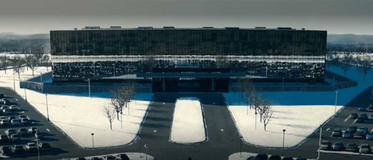
Image from Screenshot Apple Tv+
Throughout the show, starting at the building’s parking lot, there’s an ominous obsession with symmetry.
We know symmetry can portray feelings of stability and calmness in design, but on the flip side, if used excessively can create a static, unimaginative space.
Lumon creates symmetrical lobbies, seating, hallways, cubicles, and rooms—further accentuating their tidy design environment.
Was this design element used to foster a distraction-free zone where any employee (regardless of being severed) would drown themselves in only work?
Or for something more sinister?
Oddly enough, although the show’s level of symmetry creates a sense of power, dignity, and order—it still leaves viewers feeling restricted and uncomfortable.
Mid-Century Modern
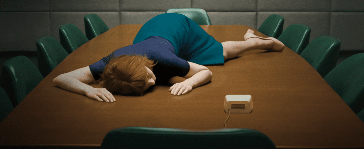
Image from Screenshot Apple Tv+
It’s evident early on in the show that Lumon’s work environment is just a place of work. This may explain its overwhelmingly organized and clean setting.
But, Lumon does pack a few pockets of beauty.
Ultimately, Lumon’s design portrays a mid-century modern aesthetic with plenty of driftwood, steel-toned office entrances, and minimal ornamentation.
Yes, there are zero design bells and whistles here—just enough function and comfort for employees to stay on task (and schedule).
But, throughout the cubicles, lobbies, and wellness rooms, you’ll notice several geometric and organic shapes, neutral color palettes with blue and green, and an emphasis on function over form. You’ll also see fresh plants dispersed throughout the building.
Still, Lumon’s office space’s strongest (and strangest) attribute is its sterility. Nothing is dirty. Nothing is out of place. And everything is in order one hundred percent of the time.
How does this make their employees (and us, the viewers) feel?
Of course, opinions may differ!
A Pinch of Fine Art
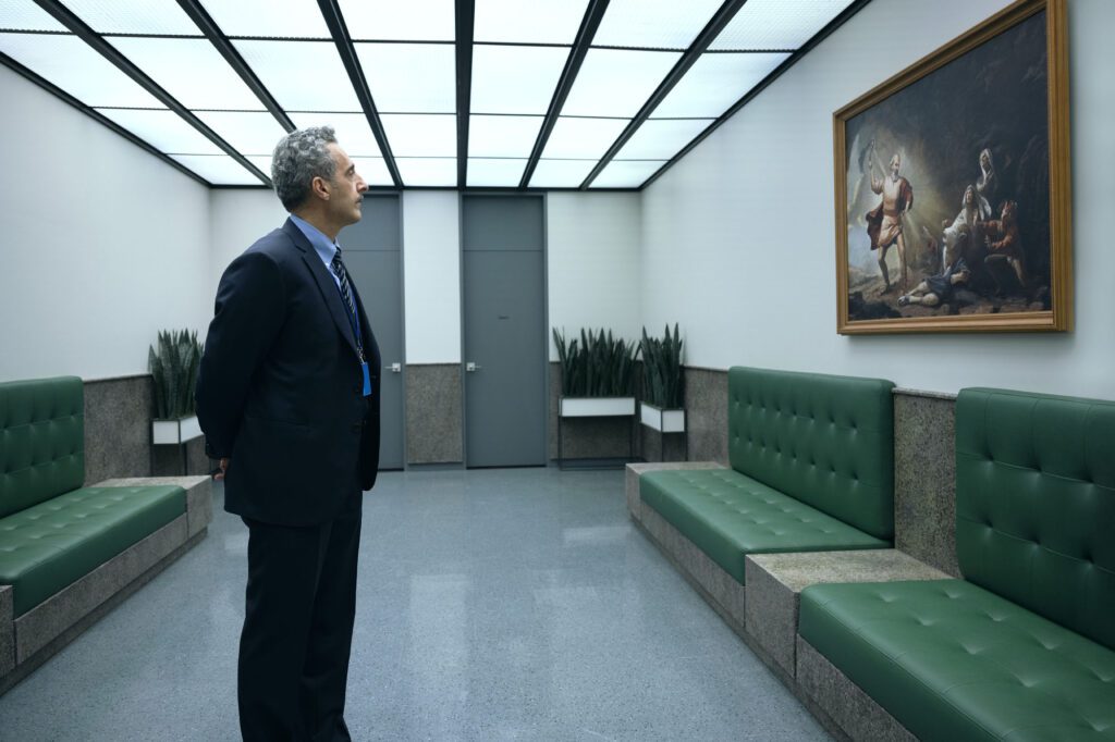
Image from Screenshot Apple Tv+
Amongst all of Lumon’s clean lines, the surprising design element in Severance was its sprinkle of fine art.
You’ll notice there’s not much on the walls in Lumon except for 3D wall clocks and paintings celebrating its founder, Kier Eagan.
But, interestingly enough, Eagan’s art is hand-painted on canvas and always hung in classical iterations, whether in black wood or museum-like ornamental gold frames.
This classic element feels so out of place in Lumon, a site where modern design spearheads every department.
So, why was this choice made?
Blue & Green
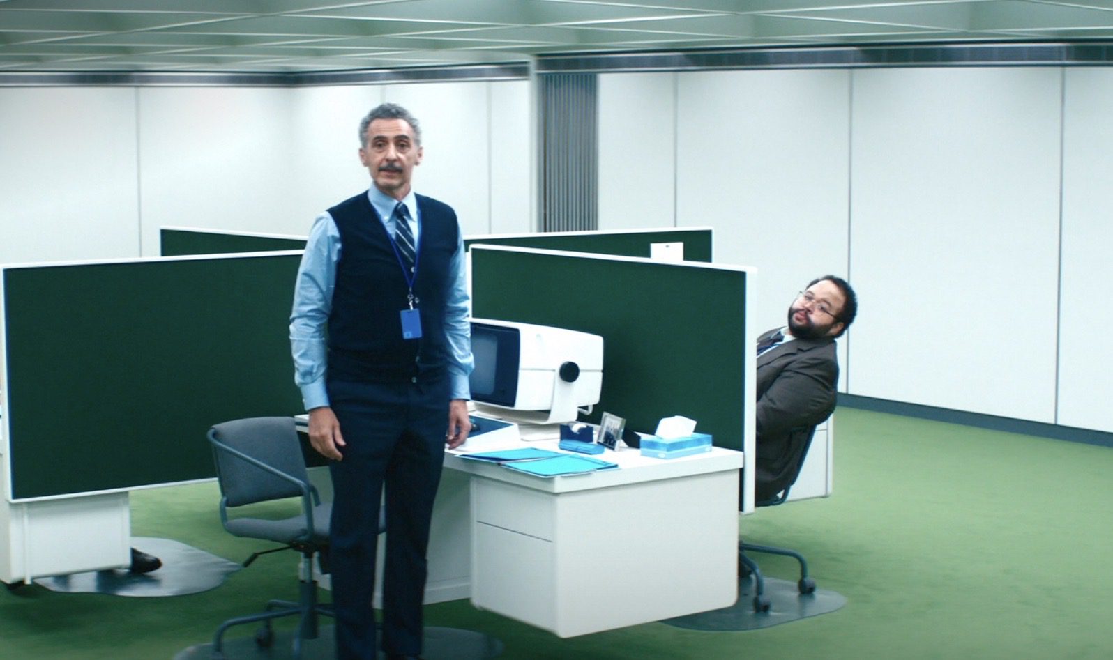
Image from Screenshot Apple Tv+
You also can’t overlook the obvious lack of color in Severance, with one exception — you’ll see blues and greens everywhere.
Used in different shades, tints, and tones, you’ll catch countless glimpses of blue and green hues strung in carpets, upholstered seating, task chairs, and artwork.
Albeit, this color combo may tone down the haunting prison vibe by a pinch, Severance’s office still feels extremely gloomy and heavy.
What makes matters worse is Lumon’s windowless basement, where employees sit on their computers daily in clustered cubicles. But, on the bright side– at least there’s green carpet.
Green is a color that typically makes people feel more emotionally safe. And when paired with blue, creates peaceful and serene spaces in interior design. Coincidentally, blue and green are also the most liked colors by males and females.
Still, despite this palette’s best efforts, it is unable to fully achieve this purpose in Severance.
Kitchen & Bath Design
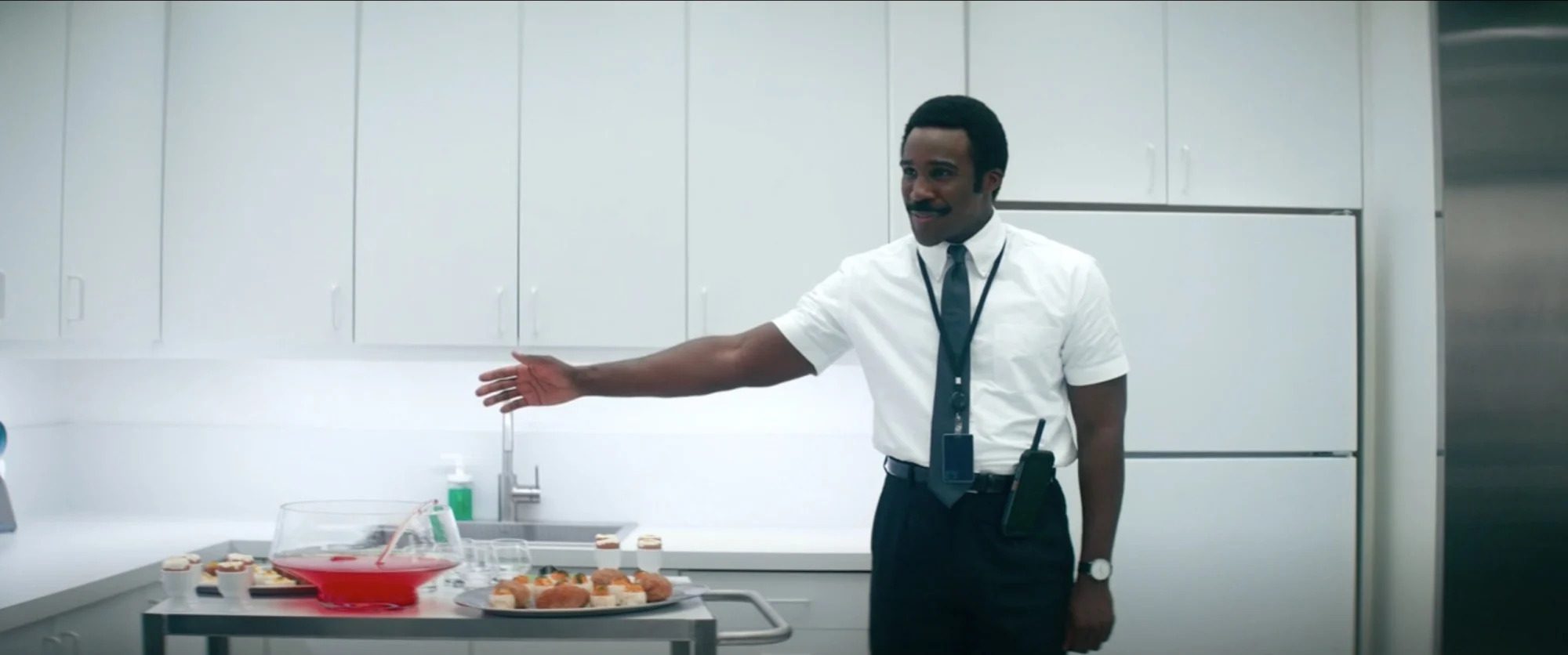
Image from Screenshot Apple Tv+
The kitchen and bath design in Lumon remains unimaginative, flaunting corporate modernism in every inch.
That’s not surprising, though; both spaces stay cohesive with Lumon’s overall aesthetic: easy to maintain and sterile.
The kitchen cabinets seem to be a white laminate, while the bathroom is covered head-to-toe in a 4×4 ceramic square green tile with white grout lines.
What Would You Add to Lumon’s Workplace Design?
Though Lumon’s design can feel cold and dreary, the building still contains beautiful architecture and organization.
Perhaps it is Lumon’s simplicity that makes its interior design visually intriguing and mysterious. But above all attempts to foster comfort and productivity through design, Lumon’s environment feels too robotic. It is this exact design veil that helps Lumon mask its true agenda.
What kind of wickedness is Lumon hiding? And will its employees ever crack the code?
For additional resources, check out these related articles:
The 12 Best Hybrid Work Solutions Introduced at Neocon 2022
Shivani is an expert writer for Gather who covers interior design, decorating, and home improvement. She has worked as a residential interior designer for 4+ years and has extensive training in space planning, 3D renderings, 2D floorplans, whole room furnishing and décor, and color consulting. She is passionate about educating communities on industry topics and has been featured in Better Homes & Gardens, The Spruce, My Domaine, Domino, Martha Stewart, and Atlanta Magazine. Currently, she is also completing her residential interior design certificate from Rhode Island School of Design’s continuing education program.